Workshop
Case study · Design systems
One system, many brands.
01 The problem
The problem
At Global Personals, our main Figma library carried our 5 highest-traffic white-label sites, out of a much larger network. Each one had its own name, logo, and colors. Every new component had to look right on all of them. Checking every brand by hand after each change wasn't realistic.
So I built each Figma component once and let the tokens handle the brand.
02 Brand flip
Switch brands. The markup stays the same.
These five brands are made up. The last one is a stress test, with a very long name and colors that fail contrast on purpose. Turn off the fallback to see what it looks like without the fix.
Contrast · every pair passes
| Pair | Figma value | Shown |
|---|---|---|
| Primary button textneeds 4.5:1 | 9.6:1 | same |
| Navbar textneeds 4.5:1 | 9.6:1 | same |
| Card label on accentneeds 4.5:1 | 9.0:1 | same |
| Link on whiteneeds 4.5:1 | 5.2:1 | same |
| Link hover on whiteneeds 4.5:1 | 9.6:1 | same |
| Focus ring on pageneeds 3:1 | 4.7:1 | same |
Contrast · every pair passes
| Pair | Figma value | Shown |
|---|---|---|
| Primary button textneeds 4.5:1 | 15.4:1 | same |
| Navbar textneeds 4.5:1 | 15.4:1 | same |
| Card label on accentneeds 4.5:1 | 8.8:1 | same |
| Link on whiteneeds 4.5:1 | 8.4:1 | same |
| Link hover on whiteneeds 4.5:1 | 15.4:1 | same |
| Focus ring on pageneeds 3:1 | 7.6:1 | same |
Contrast · every pair passes
| Pair | Figma value | Shown |
|---|---|---|
| Primary button textneeds 4.5:1 | 5.5:1 | same |
| Navbar textneeds 4.5:1 | 5.5:1 | same |
| Card label on accentneeds 4.5:1 | 9.2:1 | same |
| Link on whiteneeds 4.5:1 | 7.3:1 | same |
| Link hover on whiteneeds 4.5:1 | 9.4:1 | same |
| Focus ring on pageneeds 3:1 | 6.6:1 | same |
Contrast · every pair passes
| Pair | Figma value | Shown |
|---|---|---|
| Primary button textneeds 4.5:1 | 21.0:1 | same |
| Navbar textneeds 4.5:1 | 5.2:1 | same |
| Card label on accentneeds 4.5:1 | 8.6:1 | same |
| Link on whiteneeds 4.5:1 | 5.2:1 | same |
| Link hover on whiteneeds 4.5:1 | 6.7:1 | same |
| Focus ring on pageneeds 3:1 | 4.7:1 | same |
Contrast · 5 pairs fixed by the fallback5 pairs fail with the fallback off
| Pair | Figma value | Shown |
|---|---|---|
| Primary button textneeds 4.5:1 | 1.1:1fails | 19.2:1 #0000001.1:1fails |
| Navbar textneeds 4.5:1 | 1.1:1fails | 19.2:1 #0000001.1:1fails |
| Card label on accentneeds 4.5:1 | 8.7:1 | same |
| Link on whiteneeds 4.5:1 | 2.7:1fails | 4.6:1 #BF479E2.7:1fails |
| Link hover on whiteneeds 4.5:1 | 3.3:1fails | 4.9:1 #CC269A3.3:1fails |
| Focus ring on pageneeds 3:1 | 2.4:1fails | 3.3:1 #D951B32.4:1fails |
03 How the variables work
Brand lives in one collection. Everything else stays put.
The Figma library has a Color collection with one mode per brand. Spacing and type don't change between brands, so they have one mode each. Flip a frame's mode and every component inside it takes on the new brand.
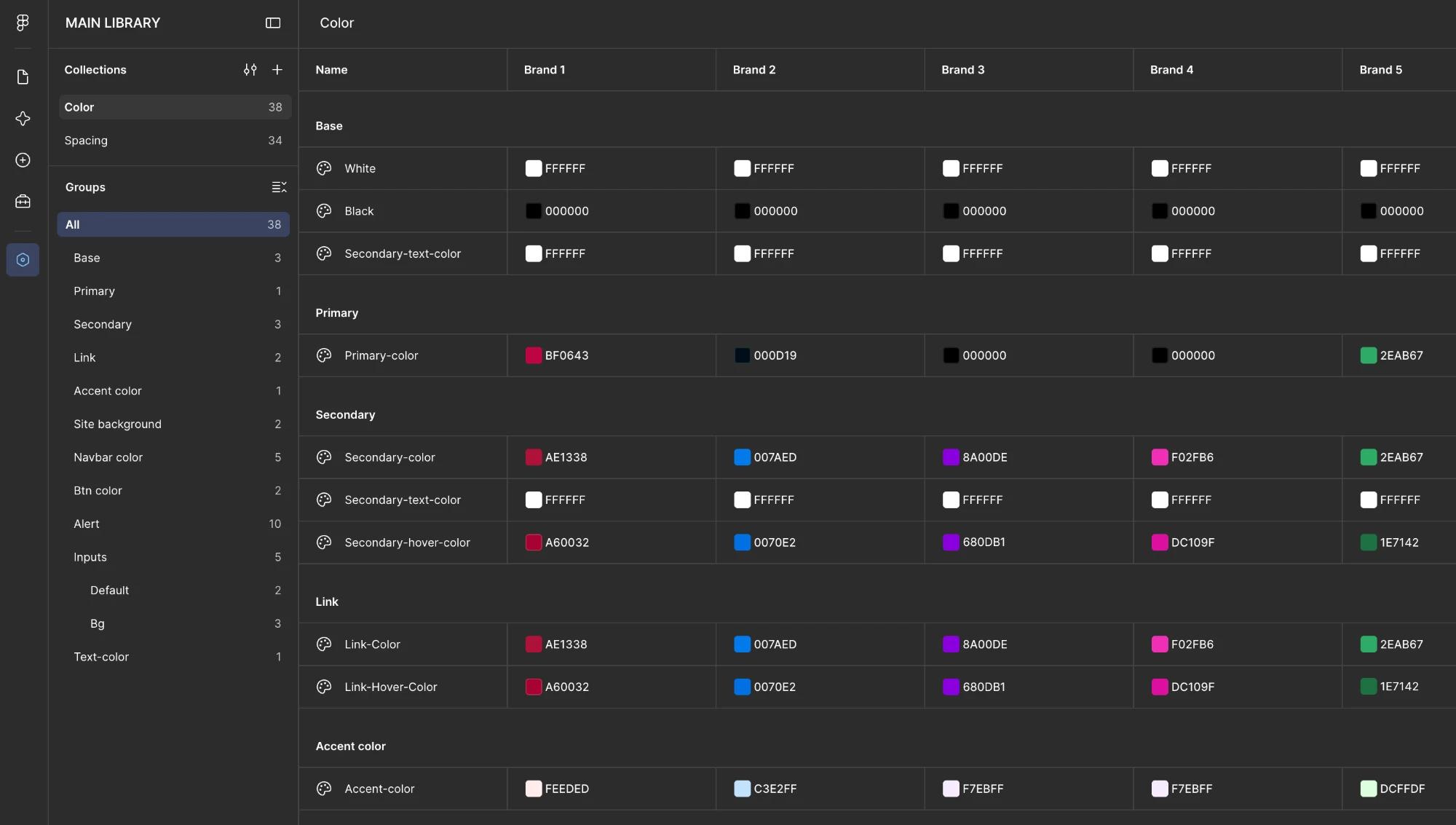
- 38Color variables, one mode per brand. Primary, secondary, links, navbar, inputs, and alerts.
- 34Spacing variables.
spacing/Nis N × 4px, the same scale as Tailwind. - AaText styles named
text-base/semibold, with Tailwind's sizes.
Same names in Figma and code
Code uses the Figma names, so a designer and a developer can search for the same word. It converts them mechanically: lowercase, and slashes and spaces become hyphens.
| Figma variable | CSS variable | Tailwind class |
|---|---|---|
Primary-color | --primary-color | bg-primary-color |
Secondary-text-color | --secondary-text-color | text-secondary-text-color |
Accent-color | --accent-color | bg-accent-color |
Button-secondary-bg | --button-secondary-bg | border-button-secondary-bg |
Inputs-bg-inactive-3 | --inputs-bg-inactive-3 | border-inputs-bg-inactive-3 |
04 Figma to code
One button, three views.
The Figma component, the live component, and the code. Each Figma binding becomes one class.
Figma · Button
- Variants
- Type, Size, State, and Style. 200 in all.
- Fill
Primary-color- Stroke
Secondary-color- Text
Secondary-text-color- Type
text-base/semibold- Padding
- 10 × 18, from
spacing/2_5andspacing/4_5 - Effect
Shadow/xs
Live · every brand
Code · HTMX and Tailwind
<!-- button.html: written for this page, not copied from the production library -->
<button
  class="inline-flex min-h-11 items-center gap-2 rounded-pill border
         px-4.25 py-2.25 text-base font-semibold shadow-xs
         bg-primary-color
         border-secondary-color
         text-secondary-text-color
         hover:border-secondary-hover-color"
  hx-post="/reservations"
  hx-target="#status">
  Reserve a seat
</button>
05 AI workflow
Give the AI a job, and a list of what not to try.
I used Cursor, Claude, and the Figma MCP to build the components in an HTMX library with Tailwind. The classes use the same variable names as Figma.
The AI did well once a markdown file defined its job. It struggled with bug fixing. So I kept a painpoints.md file. Anything that took more than a few tries went in it. Once the AI knew what not to try, it got better.
This case study was built the same way. The excerpts below come from this project's own files. They aren't the original files from Global Personals.
## Source of truth

- Variable names come from the Figma library (MAIN LIBRARY, listed under Files). Change it only when Derol approves.
- Code uses the variable name only, without its group. In Figma, `Secondary-text-color` sits in the Secondary group. In code it's `--secondary-text-color`.
- Every variable name must be unique across the collection, so dropping the group can't cause a clash.
- The name is converted mechanically, nothing more:
  - lowercase
  - spaces become `-`
  - repeated `-` collapse to one
- Tailwind classes use the same name with the utility for the property it sets: `bg-primary-color`, `text-secondary-text-color`, `border-secondary-color`.
- Spacing follows Figma's `spacing/N` scale, where N × 4px is the value. `spacing/1_5` is Tailwind `1.5`.
- Text sizes follow Figma's `text-{size}/{weight}` styles, which match Tailwind's names and sizes.
- Brand values live in `src/data/brands.ts`. Nothing else holds a color.# painpoints.md
Bugs in this project that cost at least one failed attempt and could happen again. Read this before debugging. Each entry lists the symptom, what failed, what worked, and the rule to follow next time.
## Contrast rows vanished from the table
- Symptom: rows the fallback had fixed disappeared from the contrast table.
- What failed: marking them with a plain `fixed` class. Tailwind scans `src/components/ds/` and read it as its `position: fixed` utility.
- What worked: renaming the class to `is-fixed`.
- Rule: don't use a plain class name that is also a Tailwind utility. Prefix it.06 The result
One component, every brand.
A component built once in Figma could be checked on any brand by switching a mode. The code used the same names, so it switched the same way.
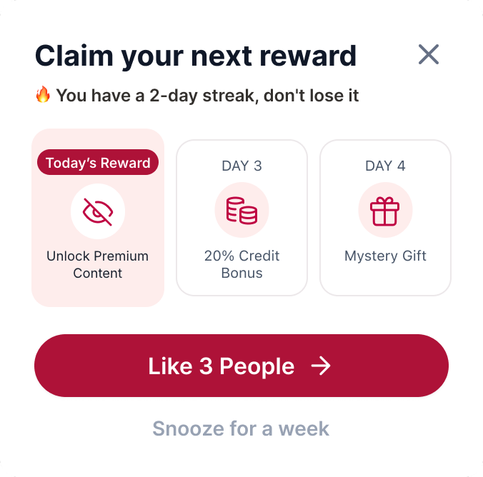
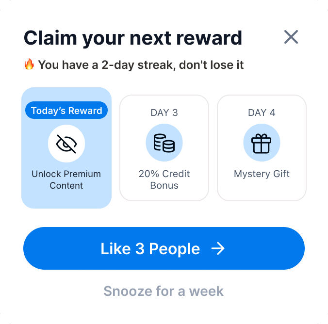
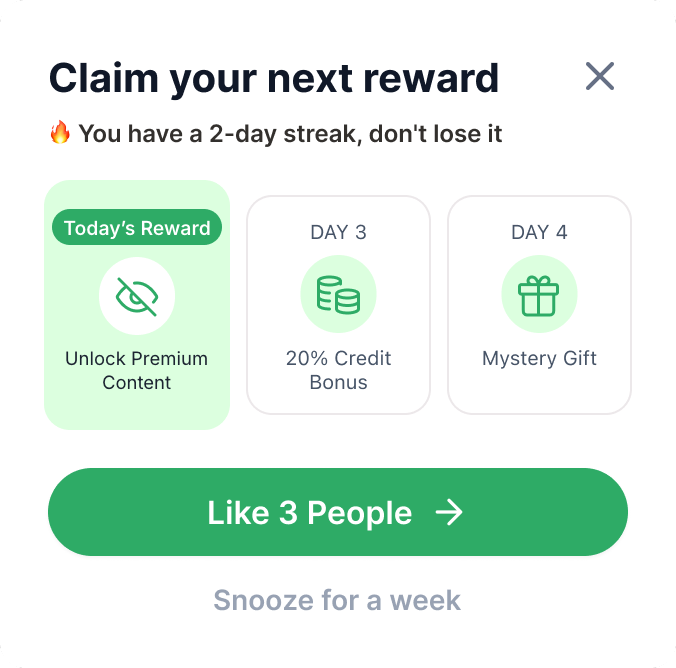
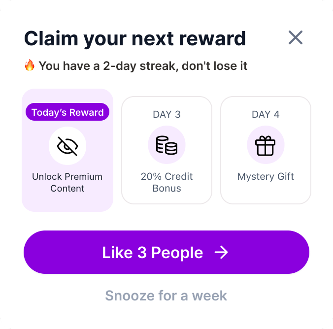
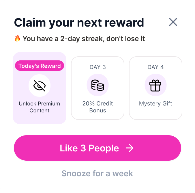
Shipped reward modal, shown in 5 of our highest-traffic white-label color sets. Only the variables change.